Humongous Catalog
3 posters
 Humongous Catalog
Recently on a thrift trip I found Let's Explore the Farm and The Airport in their original boxes, complete with the business cards, catalog, and the activity book for The Airport (The Farm was missing its activity book for some reason though, disappointingly enough). I thought I'd upload the catalog from The Airport to Imgur for everyone to see. https://imgur.com/a/DA5Pt#0
The Farm's catalog looked slightly newer and had a few minor differences (Putt Zoo is listed as available instead of coming soon, for one), but it was mostly the same overall. A few comments I have to make:
Just some more life I thought I'd breathe in this dead forum. Enjoy!
The Farm's catalog looked slightly newer and had a few minor differences (Putt Zoo is listed as available instead of coming soon, for one), but it was mostly the same overall. A few comments I have to make:
- I apologize about the moire. I can't figure out how to descreen it so it will have to do.
- These images were scanned at 600DPI, with the exception of the mail card which was done at 200DPI.
- Why the heck does Putt-Putt have a moon crystal on the Rover picture? And why is there a clickpoint running in the middle of a cut scene?
- AND WHERE THE HECK ARE GOVERNOR MOONBEAM'S KEYS!?
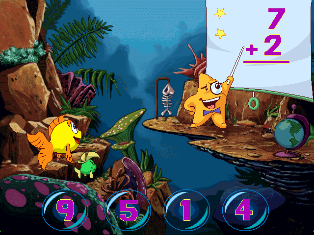
- The picture of Mr. Starfish is really odd. I don't recall that hanging skeleton in the actual game unless I missed a click point, and you can't see the junkyard in the background.
- The Airport and The Farm use their early covers here, with the circle and Buzzy flying out at an angle and without the "Let's Explore" prefix. The Farm also shows the original grey UI seen in the demo, and The Airport's UI is completely cut off. Huh.
- Putt-Putt Saves The Zoo's screenshot here is an embarrassingly obvious mockup. Pep still uses his original DOS design and Putt-Putt looks completely unnatural in this picture. Also, the billboard says "opening soon" instead of "grand opening".
Just some more life I thought I'd breathe in this dead forum. Enjoy!
 Re: Humongous Catalog
The Zoo image is very interesting, it Reminds me of that one beta image found of the game, seems like there art style for that game was leaning towards the Putt-Putt and Pep Book art style - the reason they most likely look like that (Putt & Pep) is because they where still doing a remodel for them hence its the first game Putt got remolded in
 Re: Humongous Catalog
Nice, a full size image of the screenshot! For comparison, here's how it appears in the actual game:

Differences I've noticed:
Interesting to know it wasn't just a mockup shot. Do they have any remaining surviving screenshots from when they made that catalog?

Differences I've noticed:
- No quit button. Also, they moved the equation down a little.
- There's a star system in place. I'm guessing they originally used that to tally your correct answers, but in the final game they just say it out loud.
- The background is totally different.
- They added some rock at the bottom of the screen and got rid of all the plants to the right of Freddi and Luther.
- Finally, the hanging fish. They sort of just erased it in the final game -- you can still see a semicircle from where it originally was!
Interesting to know it wasn't just a mockup shot. Do they have any remaining surviving screenshots from when they made that catalog?
 Re: Humongous Catalog
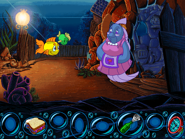
Interesting. Who had these pictures and how has he kept them for so long? More differences I've spotted:
- Grandma Grouper's house background looks identical to the final, but Freddi was moved down quite a bit. Also, when you talk to Grandma Grouper, she is frowning instead of smiling in the finished game.
- The bottle is shown unopened in the inventory; the final game has the paper unwrapped in front of the bottle. I already knew about this though because the same inventory graphic exists in the demo data, albeit unused.
- There's some reflections on the surface of the water on that second picture. These were erased in the actual game. Also, the mountains in the back are incorrectly colored blue; the final game corrects it to green.
- Freddi has a bunch of ripples around her. In the final game they only briefly appear when she first pops up.
- The green part of the buoy is missing its shine.
 Re: Humongous Catalog
That's Amazing!

PrincessRaineVillanueva- Adventurer
- Posts : 77
Join date : 2016-10-15
Age : 25
Location : Somewhere in the Philippines
 Similar topics
» Junior Adventures catalog coming to Steam!!!
» Humongous gone edgy?????
» Humongous Crossovers, anyone?
» Humongous Entertainment at E3
» How to run the Humongous Classics on a 64 Windows OS
» Humongous gone edgy?????
» Humongous Crossovers, anyone?
» Humongous Entertainment at E3
» How to run the Humongous Classics on a 64 Windows OS
Permissions in this forum:
You cannot reply to topics in this forum


