Weird Looking Foreign Covers
+2
MrEightThreeOne
Onfy
6 posters
 Weird Looking Foreign Covers
PREFACE: Alright, to avoid confusion on how I talk about things, I will define the covers. (How I go by them...)
Original Style: Original from The original 1992 DOS Mac and 3DO releases of The HE classics... Features the creepy Putt-Putt...
Mid Style: The cover art from the 1995 Windows re-releases of the Classics... not much to say there...
Old Style: The art from the "Golden age" of Humongous, Starting with Freddi Fish, it's the beautiful game-style, signature Humongous hand drawn art... From the releases from the late 90s and early 2000s...
New Style: The crap-looking style of The Atari-era releases... Started With Pajama Sam LRS, Atari also crapped it onto the 2007-era releases in America and Europe... WHY ATARI?? WHY!??
Title speaks for itself. Here I will post weird looking covers from Foreign releases of Humongous games and comment on them...

First off, It turns out that Pajama Sam 2 has been re-released in France, complete with new style cover art! It looks like crap!

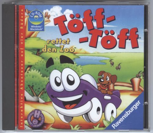
This is the cover from the original German release of Putt-Putt saves the Zoo by Ravensburger. It looks really weird...

This isn't foreign, it's just the original release art of Putt-Putt Joins the Parade. However, this art is just really weird, and Putt-Putt creeps me out, so I figure I'd put it here to creep y'all out too! :[*)

Freddi Fish is so popular in France, that the 4th game even got re-released AGAIN recently with new style cover art! Meh... I guess it doesn't look to bad, compared to the other new covers... but the original still kicks it's butt...

I have NO IDEA what the crap this is supposed to be for... It has the official Russian name and font, and has Putt-Putt and Pep, and has new-style cover art... AND PEGI AND VISTA AND NVIDIA AND GINGERBREAD HOUSE AND BEES WTF!!?????????

This is the cover art from the official Russian version of Pajama Sam. It looks pretty normal, besides what our own Retrodude says look like Pot Leaves! LOLWTF

This isn't weird! It's awesome! It's the (official) Russian cover of Putt-Putt Goes to the Moon! Done in the old style, it looks really freakin' cool... Akella really put effort in here...
More to come...
Original Style: Original from The original 1992 DOS Mac and 3DO releases of The HE classics... Features the creepy Putt-Putt...
Mid Style: The cover art from the 1995 Windows re-releases of the Classics... not much to say there...
Old Style: The art from the "Golden age" of Humongous, Starting with Freddi Fish, it's the beautiful game-style, signature Humongous hand drawn art... From the releases from the late 90s and early 2000s...
New Style: The crap-looking style of The Atari-era releases... Started With Pajama Sam LRS, Atari also crapped it onto the 2007-era releases in America and Europe... WHY ATARI?? WHY!??
Title speaks for itself. Here I will post weird looking covers from Foreign releases of Humongous games and comment on them...

First off, It turns out that Pajama Sam 2 has been re-released in France, complete with new style cover art! It looks like crap!

This is the cover from the original German release of Putt-Putt saves the Zoo by Ravensburger. It looks really weird...

This isn't foreign, it's just the original release art of Putt-Putt Joins the Parade. However, this art is just really weird, and Putt-Putt creeps me out, so I figure I'd put it here to creep y'all out too! :[*)

Freddi Fish is so popular in France, that the 4th game even got re-released AGAIN recently with new style cover art! Meh... I guess it doesn't look to bad, compared to the other new covers... but the original still kicks it's butt...

I have NO IDEA what the crap this is supposed to be for... It has the official Russian name and font, and has Putt-Putt and Pep, and has new-style cover art... AND PEGI AND VISTA AND NVIDIA AND GINGERBREAD HOUSE AND BEES WTF!!?????????

This is the cover art from the official Russian version of Pajama Sam. It looks pretty normal, besides what our own Retrodude says look like Pot Leaves! LOLWTF

This isn't weird! It's awesome! It's the (official) Russian cover of Putt-Putt Goes to the Moon! Done in the old style, it looks really freakin' cool... Akella really put effort in here...
More to come...
 Re: Weird Looking Foreign Covers
My thoughts:
Picture 1 - That barely even looks like the game! Don't these people know basic marketing?
Picture 2 - A bad photoshop of a random background with art for Putt-Putt edited in. What else can I say?
Picture 3 - That smile will give me nightmares.
Picture 4 - Pretty much what you said.
Picture 5 - WTF IS THIS?
Picture 6 - And the purpose of the leaves are...?
Picture 7 - I could totally see them remaking this game into modern-type stuff and using this for the cover.
 Re: Weird Looking Foreign Covers
My comments on Legoking's comments...
My general consensus on France has always been that they don't seem to give a crap...
I dunno... It's not very interesting, but pretty weird...
Glad to spread the horror!
YAY!!!
My research indicates that it is a multi-game compilation of the official Russian Putt-Putt translations...
To make people want to get high?
IT MUST HAPPEN!!!
legoking831 wrote:Picture 1 - That barely even looks like the game! Don't these people know basic marketing?
My general consensus on France has always been that they don't seem to give a crap...
legoking831 wrote:Picture 2 - A bad photoshop of a random background with art for Putt-Putt edited in. What else can I say?
I dunno... It's not very interesting, but pretty weird...
legoking831 wrote:Picture 3 - That smile will give me nightmares.
Glad to spread the horror!
legoking831 wrote:Picture 4 - Pretty much what you said.
YAY!!!
legoking831 wrote:Picture 5 - WTF IS THIS?
My research indicates that it is a multi-game compilation of the official Russian Putt-Putt translations...
legoking831 wrote:Picture 6 - And the purpose of the leaves are...?
To make people want to get high?
legoking831 wrote:Picture 7 - I could totally see them remaking this game into modern-type stuff and using this for the cover.
IT MUST HAPPEN!!!
 Re: Weird Looking Foreign Covers
Just finished a little something I whipped up in Paint.net

EDIT: I also just realized that you can see a chunk of freaky Putt-Putt's front wheel in the box art of the American re-release version. Look just below the new Putt's front bumper and above the game title.
ANOTHER EDIT: Now that I look at it, the box art of the American re-release of Putt-Putt Joins the Parade is very badly edited. The flowers and lightning seen above Putt's eyes can still be seen partially next to his rear wheel. For some reason they didn't erase that even though they clearly erased Pep, who looks more like Scooby-Doo on the original version's box now that I think about it.
By the way, WHY are there TWO dashes in Putt-Putt's name on the German Zoo art?
Last edited by Retrodude on Fri Nov 25, 2011 10:43 am; edited 1 time in total
 Re: Weird Looking Foreign Covers
I've thought about what it would be like to remake the classics for a while. It'd be really cool, since the originals haven't had much love because developers think they're too outdated. They're now reaching Keep Circulating the Tapes territory.
 Re: Weird Looking Foreign Covers
By remaking them, would you mean completely redoing the games in the style of Humongous' later "interactive cartoon" style gameplay as started in Freddi Fish, or would you simply have the graphics upgraded to modern hi-def standards? I personally like the games untouched, but having them in HD would be nice, similar to the way LucasArts remade Monkey Island 1 + 2. I couldn't imagine playing Fatty Bear without being able to have him walk to a specific point.
 Re: Weird Looking Foreign Covers
Retrodude wrote:Just finished a little something I whipped up in Paint.net
VERY NICE... might want to get rid of the Akella logo though...
 Re: Weird Looking Foreign Covers
I was thinking about moving the Humongous logo there, but it would be too much of a pain to draw in the chunk of background that it obscures. I was also debating putting a ratings symbol there, but those usually go on the left side.
 Re: Weird Looking Foreign Covers
Thunder and Lightning aren't so Frightening: That looks more like Life is Rough when you Lose your Stuff. Surely, they could've used the picture of Sam when he finds his cape for the cover (a la the GameTap release).
Putt-Putt Saves the Zoo: (snort) WTF IS THIS?! HE LOOKS MORE LIKE HE MADE A CAMEO IN THE LION KING (1993)!!!!!!!!!!!!!!!!!!!!!!1!!!!!!!!!!!1111
Putt-Putt Joins the Parade: Putt-Putt looks 3D! LOL
Freddi Fish and the Case of the Hogfish Rustlers: Not interseting, but it looks like it's been "untooned".
Putt-Putt Travels through Time: NNNNNNNNNNNNNNNOOOOOOOOOOOOOOOOOOOOOOOOOOOOOOOOOOOOOOOOOOOOOOOOOOO!!!!!!!!!!!!!!!!!!!!!!!!!!!!!! WHAT HAVE THEY DONE TO MY CHILDHOOD THEY RUINED IT!!!!!!!!!!!!!!!!!!!!!!!!!!!!!!!!!!!!!!!!!!!!!!!!!!!!!!!!!1
No need to Hide when it's Dark Outside: No need to hide when it's Fall outside!
Putt-Putt goes to the Moon: Wow! I see you're happy! It actually looks like the style used in 1995! Maybe they redrew the graphics and used this for the cover! What will they think of next?
 Re: Weird Looking Foreign Covers
My thoughts on these:
Picture 1 - Why is it storming on a green background?!? AND WHAT IS DOING HERE??
Picture 2 - That name "Toff--Toff" just made me laugh so hard, and plus the "rettet den Zoo" text aswell made me laugh. xD
Picture 3 - Oh god, that face though... D: I'm gonna have nightmares tonight.
Picture 4 - This is pretty good. atleast better than the Pajama Sam one, though it may look weird, I like it.
Picture 5 - WHAT THE CRAP IS THIS?!? IS THIS A BOOTLEG?? Well, first of all, it has the PEGI rating. but I don't get WHY there's a Windows Vista certified logo and a NVIDIA logo. Any HE game can run on Vista, but none of them (except Backyard Sports) has 3D. and I don't get why there's bees and a gingerbread house.
Picture 6 - *insert MLG and Snoop Dogg here*
Picture 7 - This is the best cover to a video game ever. All it needs is the Akella logo taken off and the ESRB ratings.
Picture 1 - Why is it storming on a green background?!? AND WHAT IS
 DOING HERE??
Picture 2 - That name "Toff--Toff" just made me laugh so hard, and plus the "rettet den Zoo" text aswell made me laugh. xD
Picture 3 - Oh god, that face though... D: I'm gonna have nightmares tonight.
Picture 4 - This is pretty good. atleast better than the Pajama Sam one, though it may look weird, I like it.
Picture 5 - WHAT THE CRAP IS THIS?!? IS THIS A BOOTLEG?? Well, first of all, it has the PEGI rating. but I don't get WHY there's a Windows Vista certified logo and a NVIDIA logo. Any HE game can run on Vista, but none of them (except Backyard Sports) has 3D. and I don't get why there's bees and a gingerbread house.
Picture 6 - *insert MLG and Snoop Dogg here*
- Spoiler:
- SMOHK WEE EVERYDAE
Picture 7 - This is the best cover to a video game ever. All it needs is the Akella logo taken off and the ESRB ratings.

HumongousFan1998- Adventurer
- Posts : 44
Join date : 2015-01-15
Age : 21
Location : Somewhere, somewhen.

PrincessRaineVillanueva- Adventurer
- Posts : 77
Join date : 2016-10-15
Age : 25
Location : Somewhere in the Philippines
 Similar topics
» Foreign Language HE games on Steam!
» Steam is weird
» Possibly Rare but Weird Icons
» My turn to find a weird Hulabee game
» Steam is weird
» Possibly Rare but Weird Icons
» My turn to find a weird Hulabee game
Permissions in this forum:
You cannot reply to topics in this forum


